A friend of mine, who likes the odd pint from time to time, and I were discussing the relative merits of beer bottle labels and pump clips and the effect they have, if any, upon the potential buyer. He is a design and marketing bod so was looking at the subject from that angle. I was looking at it through the bottom of a glass.
 The internet, being what it is, very quickly threw up a few articles on the subject and we looked at a piece from the guardian that, not surprisingly concentrated on the ridiculous and sexist and held them up for ridicule and in turn this received some of the usual comments one expects from the below the line’ I don’t watch Mrs Brown’s Boys because it doesn’t have subtitles’ brigade; ‘typical beer drinkers’ ‘lowest common denominator’ etc and while it easy to dismiss such self-aggrandising sanctimonious tossers it has to be admitted that some of the labels presented were a bit ‘heavy-metal cliché porn masquerading as 6th Form Art project’ with buxom wenches held captive by snakes and chains or to be more precise knickerless nuns (not to be confused with Nicholas Parsons) who have lost a contact lens.
Drawings of buxom lasses whose lascivious smile seems to indicate that if you drink enough of the product then you will get to have sex with someone like that. Been drinking beer or over 30 years – let me tell you friend, not going to happen.
From a spot of ad hoc research among my friends who like a nice bottle of ale but would never consider themselves connoisseurs they are quite happy to admit that, to them, by and large most beers of a genre taste much of a muchness. As a result of this lack of fine distinction they will select from the supermarket shelf on the basis of how a bottle looks. I am sure that my friends are not the singularity and that this must happen all over the country every day so why do so many breweries insist on decorating and promoting their hand crafted ales with such bloody awful labels and pump clips?
What is the main problem with these labels? the issues range from being dull, puerile or just plain offensive but worse than that; some of them are just plain naff.
The general public’s perception of beer drinkers hasn’t moved as fast as the quality of the output of micro-brewers and, to most, the image of a real ale drinker that springs to their mind is the beardy-weirdy CAMRA fanatic slavering over hops and a pint of flat yellow witches widdle that was brewed in a shed in Tadcaster. The use of appalling, badly conceptualised and designed labels does not help.
The modern consumer is constantly bombared with images and vast sums of money are spent on perfecting the brand, look and image of all products. It doesnt matter whether we are taking lasagne, ferrari or ale, it has to be appealling to all the senses and that includes sight.
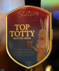
We all know of the ‘Top Totty’ that was removed from the bar in the House of Commons for being sexist but apart from that it just looks so uninspired and you have to think ‘well, that must have taken them minutes to come up with that; how much effort was put into the beer ?’ this may not be fair but people buy by instinct if it makes then feel good about themselves and then rationalise it later, equally they DON’T buy on instinct if their natural instinct is going be that they feel a knob ordering a pint of ‘Top Totty’, result; they are not going to buy it. Oh and I can imagine you can kiss goodbye to the majority of potential female purchasers.
Another issue I have is the awful puns that sound like chants from the back of a rugby bus.
Not wishing to name names but Skinners who make a smashing drink, particularly enjoy the Heligan Honey, have some labels that while not the kind to bring on the end of the world, do themselves no favours with bottles labelled up with such cringe-inducing titles as ‘Ginger Tosser’ with suitably unappealing labels. I know this is only me talking but I can’t be the only one who, as both ginger and a tosser, is put off by the slightly puerile nature of the name and label.
People are going to be put off by a label that looks like this but people would not be put buying something with a stylish, eye-catching design with the same product inside. It is some kind of ‘outsider-art’ perversity that makes brewers want to alienate potential customers.
Now I not advocating that all small brewers just set their sights on design award-winning labels at the expense of the quality of their beers but would it hurt to try and produce a bottle that you don’t feel like Sid the Sexist or Finnbar Saunders as you hold it in your hand ?
There are some really nice well designed bottle labels out there. The York Brewery range have a singular theme that is understated yet stylish.

 This is not provincial snobbery because I happen to live in Yorkshire I just feel that the labels set out clearly what you are getting and look good when doing it. This is what a label is meant to do.
So what do you think? am I missing the point and are labels irrelevant compared to the contents or should the bottle and it’s contents be viewed as an overall package that is sought out by the end consumer not only on the quality of the product but the ‘feel-good’ factor engendered by the look of the product? Please, let me know.


Pingback: The art of beer or never judge a drink by its cover | SilverBlueMarketing
Being a “self-aggrandising sanctimonius tosser”(!) aka “Guardian Reader”………Brewers can create whatever labels they like, but the gross-out stuff is mostly plain stupid and acheives little except to put people off. I (presumably like you, Mike) want a label that differentiates and informs me as to what the beer actually TASTES like. For instance (even at this early hour!) I hold in my hand, a bottle of Jarl by Fyne Ales…..”JARL….A hoppy blonde session ale….”. Whilst the description fails to do justice to this modern classic pale beer, it gives you an idea what to expect. THAT is all I ask!
Hi BeersM I believe that this is called a negative inverse syllogism in that while all crows are black birds not all black birds are crows (thought I may be wrong). Not all Guardian Readers are self-aggrandising sanctimonious tosssers majority but most SAST’s are GRs !. Couldn’t agree more, no need to impress with your design skills, if you tell me what I am going to be drinking that is going to be enough. Taking style over content to the extreme I had a bottle of ‘Build A Rocket Boy’ as ‘designed’ by Elbow. Great band, average beer.
Hi Mike – this is a great blog! You posted in response to the wienie who complains on Slate about sexism/misogamy in craft brew labeling. This guy (?) would have wet his lace panties had he come across the name of a recurring ale put out (pun intended) by Rock Bottom Brewery in Denver. This gem is call “Lil’ Dickens Cider” and it tastes great. Only comes around once per year. RB brews the best in the city….
Jack Barr
Thanks Jack – appreciate the response. Don’t know if you are aware of Jamie Oliver, he is one of our uk top tv chefs, but he has a mobile bar called ‘the cock in cider’, a tad puerile but you know how us English look a smutty gag, hell we invented Benny Hill ! Overall I think that the craft beer industry is a great leveller. I know of very few predominantly male hobbies that don’t welcome women in to their fold, most men like most women and men who like beer tend to like women who like beer – win win situation – cheers.